Appropriation is taking an already existing piece and then changing it visually so the context and meaning of the piece. In maybe cases this is by photoshopping the piece with additional images or text. In the world of artists Appropriation has caused some commotion we some believing it to be stealing of the original piece. Where others believe that Appropriating it and changing the meaning being the piece means it is something new.
One of my inspirations for my work was Richard Prince or to be more precise the one image that he appropriated of a magazine cover which was of a cowboy riding a horse through a desert landscape. it gave me this idea of messing about with removing text and adding text to different images. Which i used more in my frozen piece of appropriation. Richard Prince has had a lot of controversy in the past with is art work and whether or not it classes and art and also as his, this is due to the whole ideal of appropriation in which it’s an already image that exists being modified to create a new meaning.
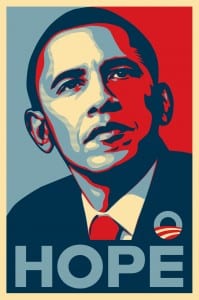
Another inspiration was of Frank Shepard Fairey who created the original “HOPE” image of Barack Obama by editing a picture of Barack Obama to give it a contrast between red and blue, with small yellow and pale blue strips. this makes the image very clear and sharp while the colours makes it stand out. Fairey also came under legal fire for the idea of Appropriation since he used an image of Barack Obama and the original photographer owns the right to the image. Fairey is know for being a street artist you can see that in the use of colours and contrast in the hope image.
A third inspiration was the website adbusters, who take advertising images and appropriate them to have a meaning that normally shows the darker side of a company, such as taking fast food adverts and turning it into a piece based on health and how unhealthy fast food is. This helped inspire my final image not only with the subject of fast food but with the idea of mixing a company logo with another image to create a new meaning.
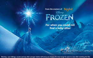
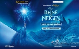
I decided to take one of the posters for Frozen and appropriate it to show an opinion on the film and how it is used as a baby sitting tool but also turns younger children into an annoyance with their renditions of the musical numbers in the film. I decided to go for the French character poster of Elsa due to how more art like the design of the poster is and it left me room to leave text just like the original poster. i also found the logos for Frozen and Tangled to add them to the image since the original had them in French. As you can see below the original poster has alot more logos and writing on. I decided to simplify it to make it more like English/American style posters. I find this also has the effect of showing the art of the poster off more.
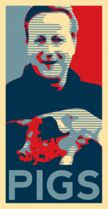
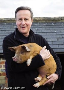
For my second piece I decided to appropriate the recent image of David Cameron holding a pig and then use it to parody the “HOPE” image of Barrack Obama. this involved copying the same image and changing the threshold to various levels then colouring each a separate layer and then add in shapes to the back group of the image then text to the bottom. i wanted to relate the hope the the leader of America bring to his country while the counterpart in the UK is currently a laughing stock due to a news story involving the prime minister and a pig. Below is the original version of the hope image and the original David Cameron image.
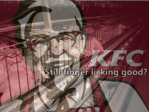
For my third and final image i took the KFC logo and made it slightly transparent over the top of an image of a chicken battery farm. I then added the caption “Still finger licking good?” to counteract and parody the KFC slogan of “finger licking good” as if the image is enlighteing the viewer after seeing where the chickens come from. the image of the logo over the top of the true source of the food is a shock factor to most people to see the living conditions of the animals that we later eat.
