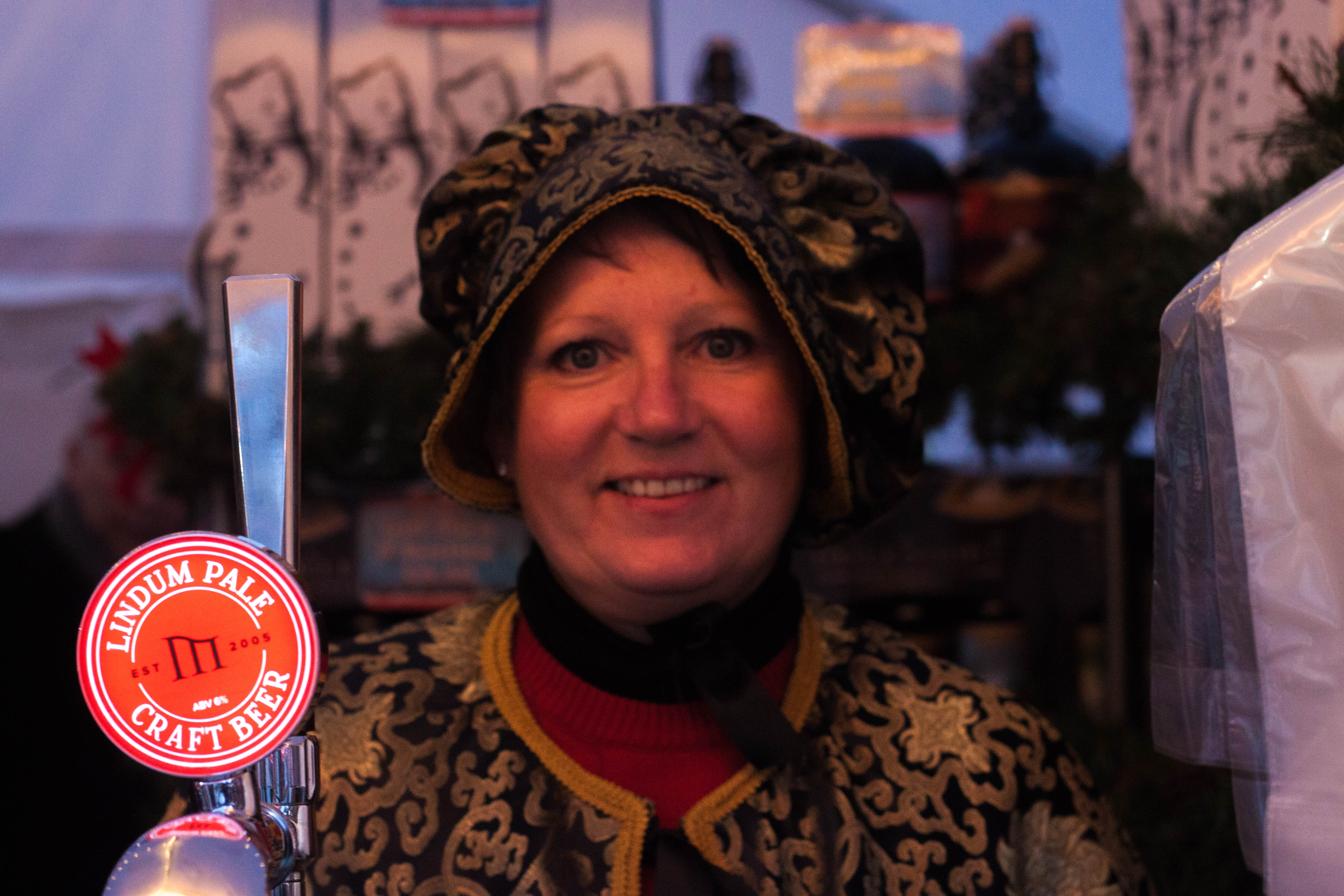
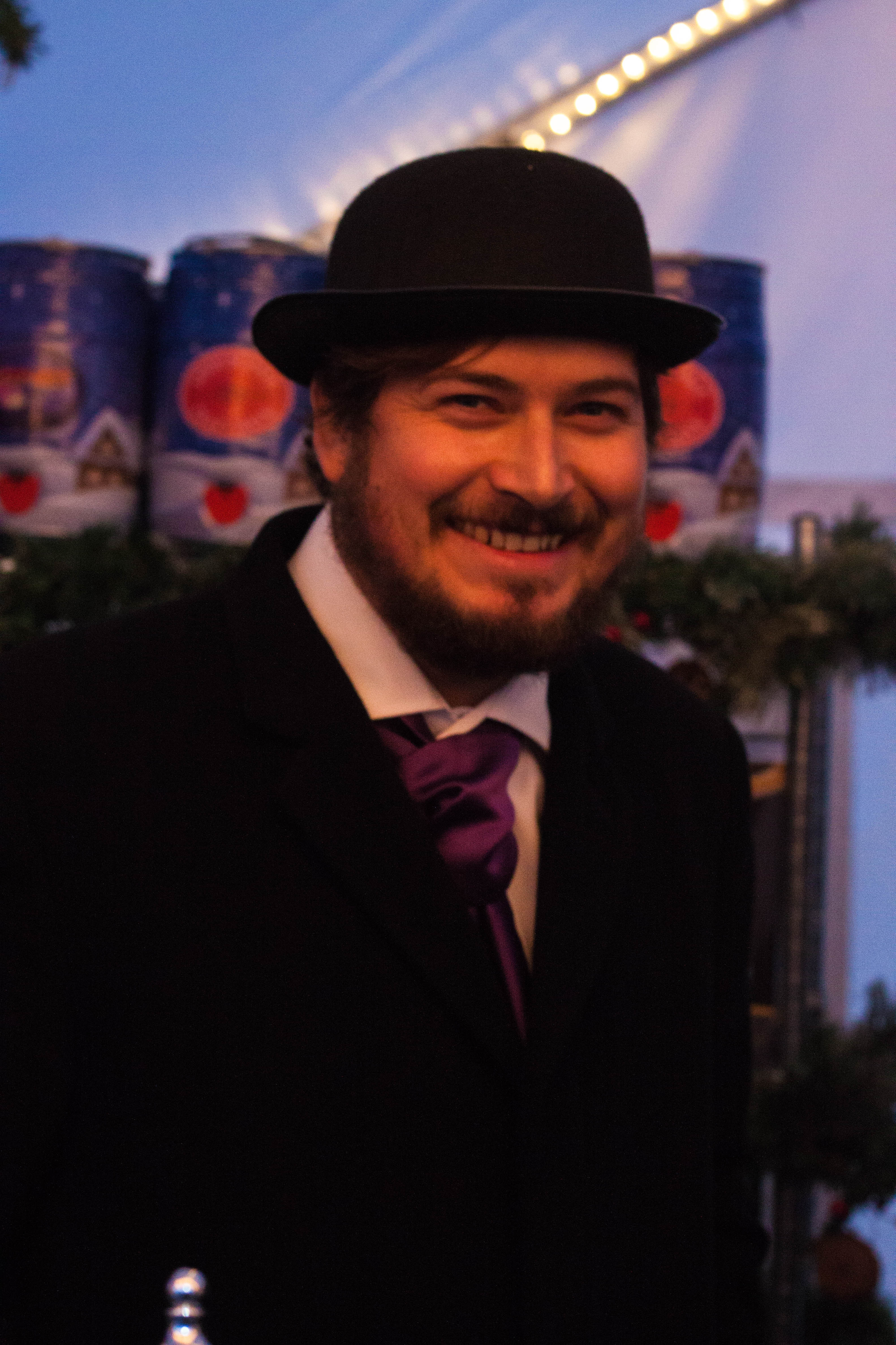
The second task for portraiture was to take picture of complete strangers. Since the Christmas market was in Lincoln I decided to see if I can find some more uniquely dressed people to photograph. In the end I decided to take photograph of the people running an Ale stall. I chose these people because their clothing was vintage and not something you would see everyday. I decided to use the environment of their stall as a background. I found it easy to ask them once i spoke with them a bit and they was very happy to help even saying to wait a minute so he could go get his scarf and hat.
With this image I got the subject to stand slightly in front of the tap and kept the tap in focus, this was to show more of the environment and what the persons job is. The boxes and other things also made a mice background and the went around the area gives it a Christmas feel. I’ve also fiddled with the temperature and other parts of the image to create a warm glow effect.
With this image I managed to get the barrels in the background. Like with the first image i managed to give this a nice glow and use that along with the white in the image to create a Christmas like atmosphere. I feel the clothes such as the hat and his suit give the look of an older time, creating a much more unique image, making it look almost period (besides from the more modern environment). I also managed to interact with the subject for them to feel comfortable and for them to give a natural smile. Again this joy and cheer really gives across the message of Christmas cheer which is what I really wanted to show with these two images.
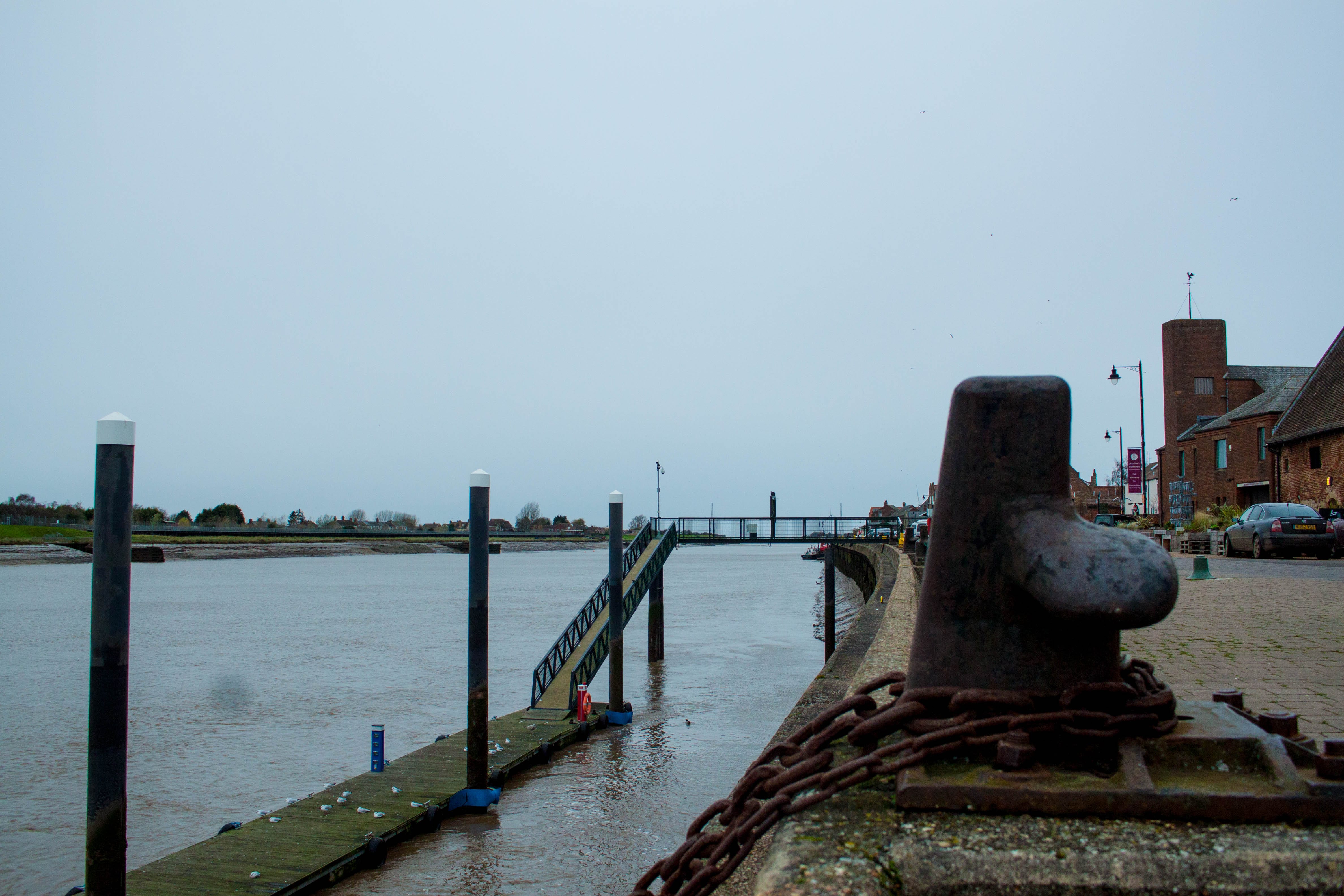
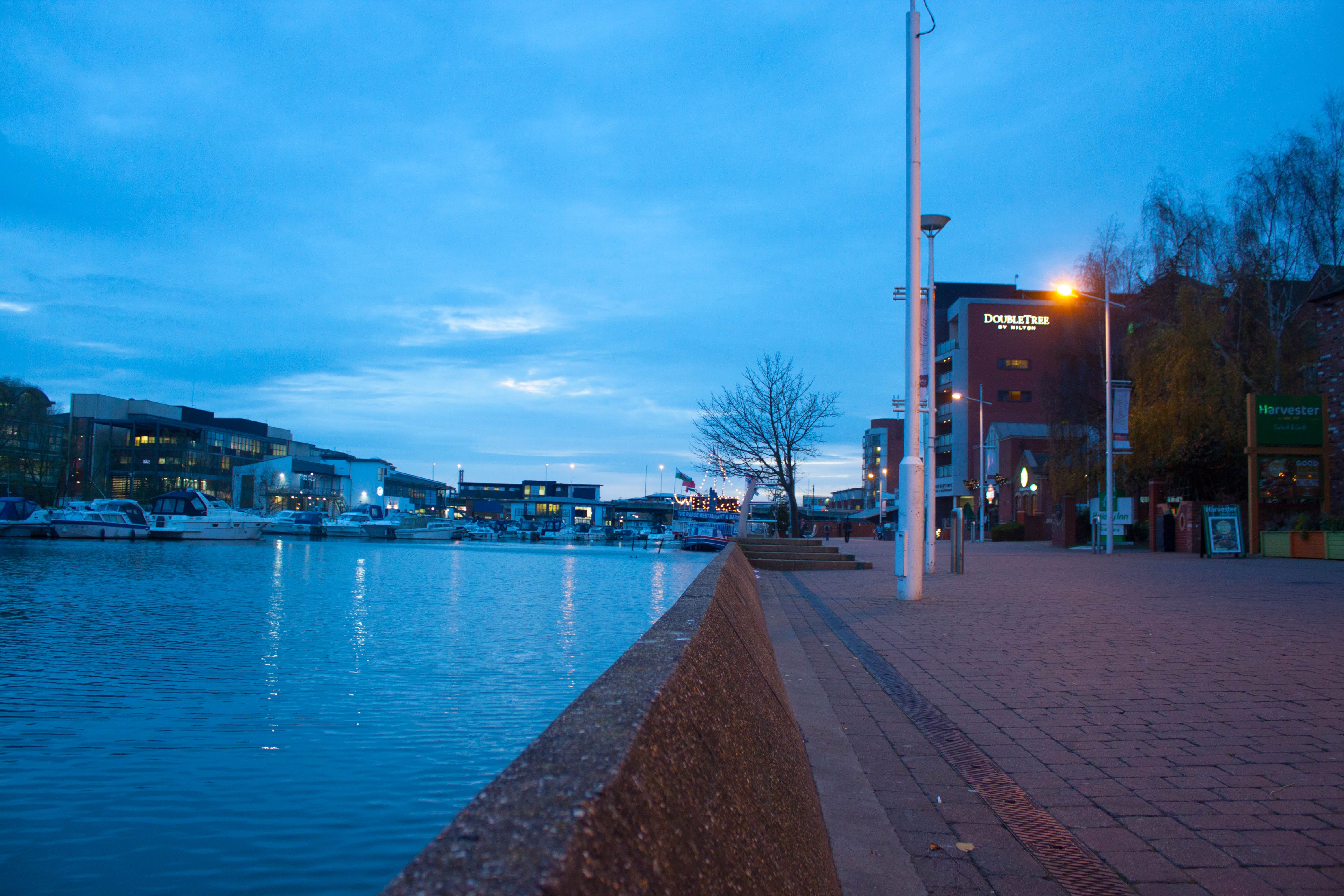
For these 6 images i wanted to create Parallels between my home town of Kings Lynn and the place I’m living in now which is Lincoln. The First image is that of the green Quay, it holds alot of memories for me growing up. I used some of the environment in the foreground to hide what is behind it and bring more attention to the foreground as well as being able to look into the distance of the background.
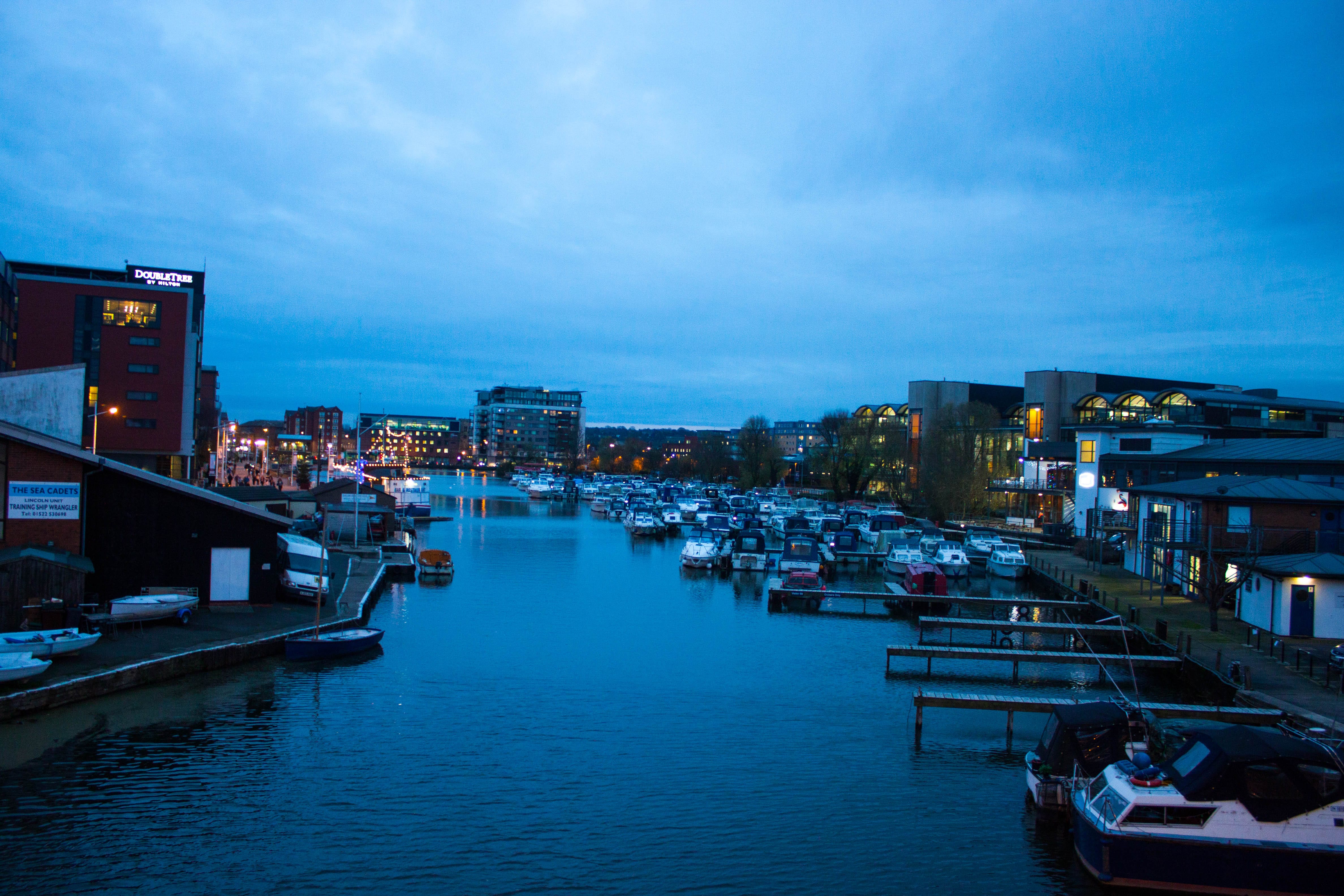
The image that’s the middle right is of the Brayford quay in Lincoln, I decided to use the slight ramp that leads to the waters edge to get higher at first but then decided to go for a lower angle. This helped create a longer shot and an overall better image that I am happy with. shooting in the evening made it a bit harder to shoot the image but by opening up the aperture and then using Lightroom I managed to get a natural glow from the image that I’m really happy with.
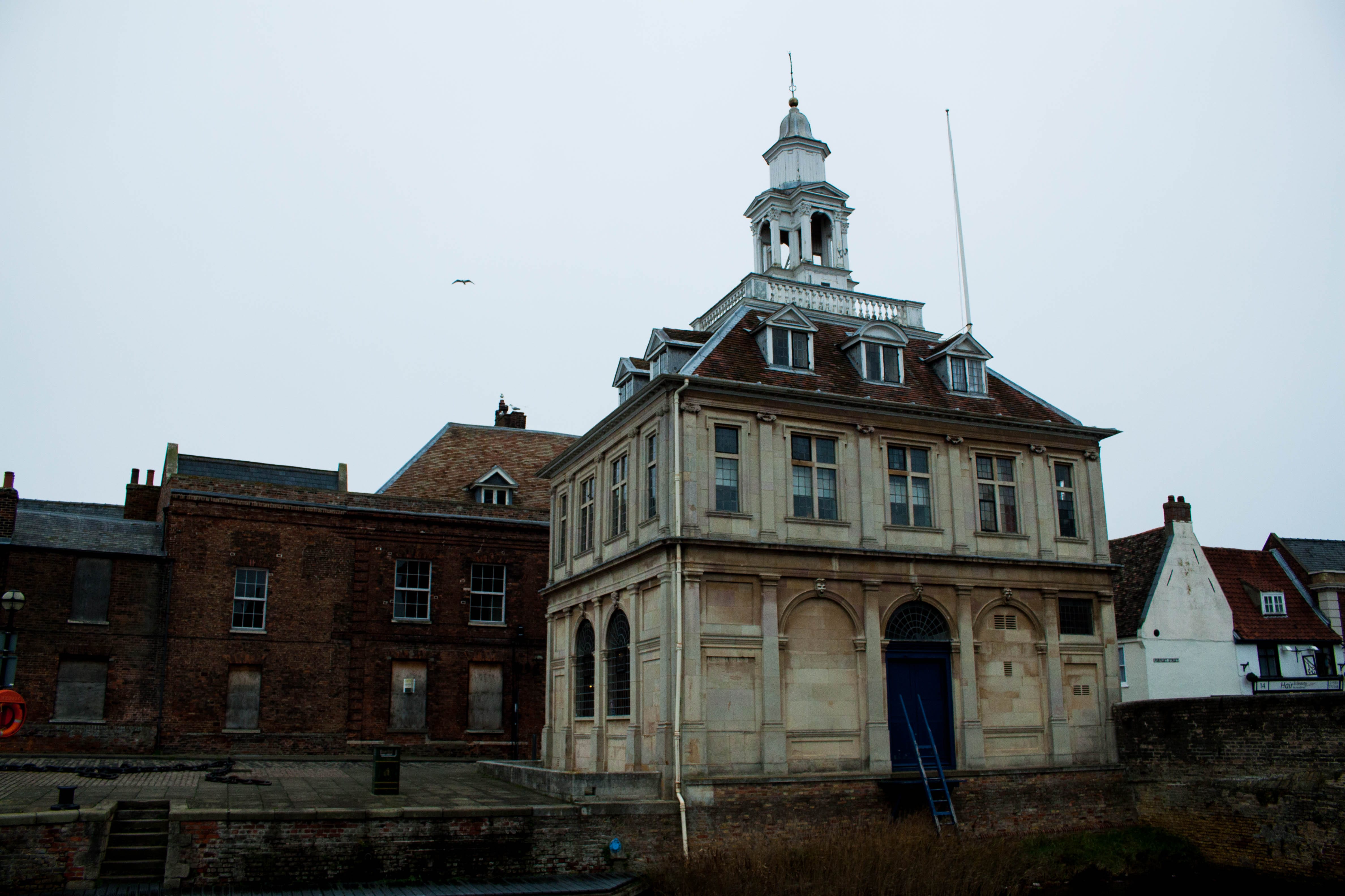
The third image (top right) is of the custom house in Kings Lynn, it is also the tourist information. It holds the memories of researching the local history and events for school projects when I was younger. I wanted to get some of the other buildings around it to show the historical architecture of Kings Lynn. I really wanted to include the bottom half of the image as it shows how it is situated on the waters edge and hope it’s’ just a sheer drop.
The fourth image is bottom right I decided to walk up the bridge above the water to take a long shot that captured most of the Brayford. due to the time of day it gave off a calming atmosphere. I really liked how the water looked so i brought the clarity up in Lightroom slightly to show it better. I was able to get alot of the buildings and boats into the shot. I a way the mass of boats on the right parallels that of the people and business’s and homes on the left.
The fifth image (middle left) is of the cathedral in Kings Lynn. I wanted to try and show the age of the building, I did this by bringing up the clarity. I found the original image was a bit blue so I turned up the temperature, this helped correct the colouration of the image. I managed to get the whole of the building in as well as some of the surrounding area . There are some tree in the shot that I feel add to the overall image since it gives us something else to look at instead of it just being the cathedral.
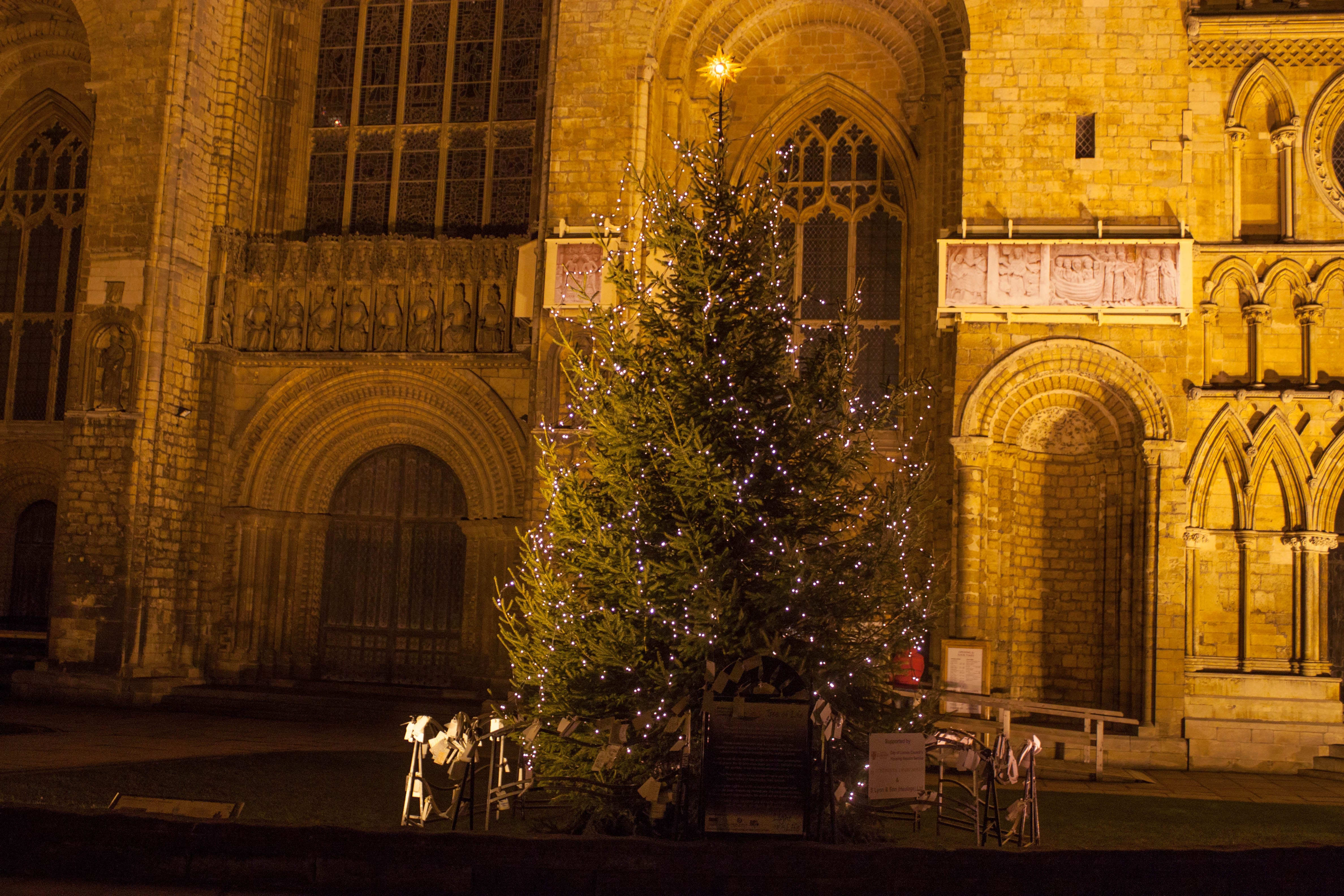
The final image (bottom right) is of the Christmas tree just outside of Lincoln Cathedral. Having a picture at the Cathedral is to parallel the cathedral back in Kings Lynn. The image of a Christmas tree also gives off a friendly feeling, you tend to think of home when looking at a Christmas tree you tend to think of home since we normally put one up inside our homes and decorate it, they provide light and create a happy atmosphere. I was hoping to capture this atmosphere in this collection of images, which is why this image is the perfect one to finish it off as it symbolises the very thing i was trying to show.
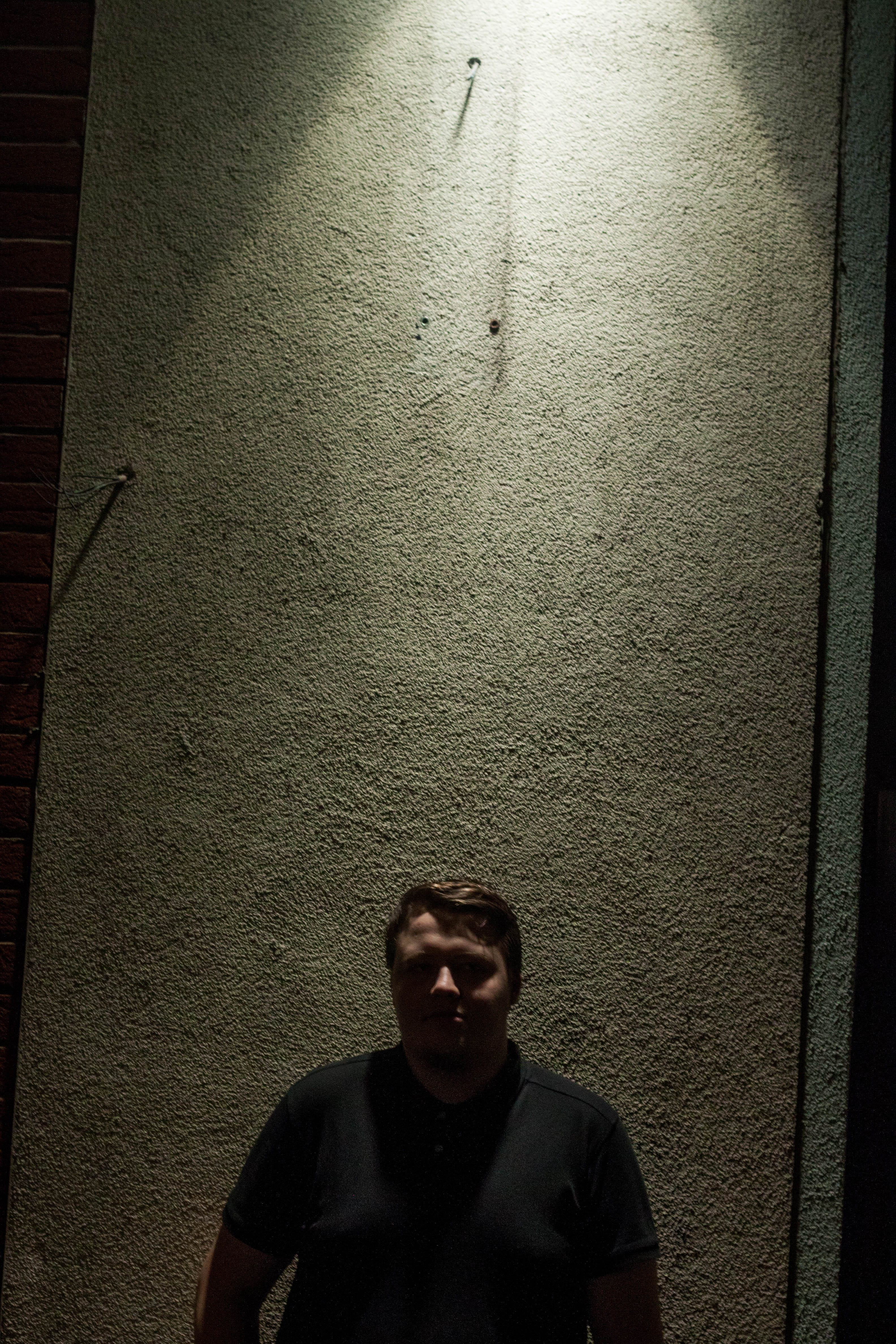
We was given the of creating 4 portrait images of subjects of our choosing. We should be concentrating on what makes the image, this means factors such as the lighting and compositions of the image and where the subject (and any props) are placed within the frame of the image. Personally i decided to shoot later in the day to get a darker lighting, using a high light shooting light directly down to give a noire like effect. I also took inspiration with this idea from the poster for the original Exorcist movie. I played around with casting shadows and making the image seem moody yet clear.
Portrait 1
For the first Image I went for a more wide image approach, this allowed me to show the shadows created on the body and emphasize it. In light room I’ve brought up the highlights and shadows while also tweaking the black and white balances.
Portrait 2
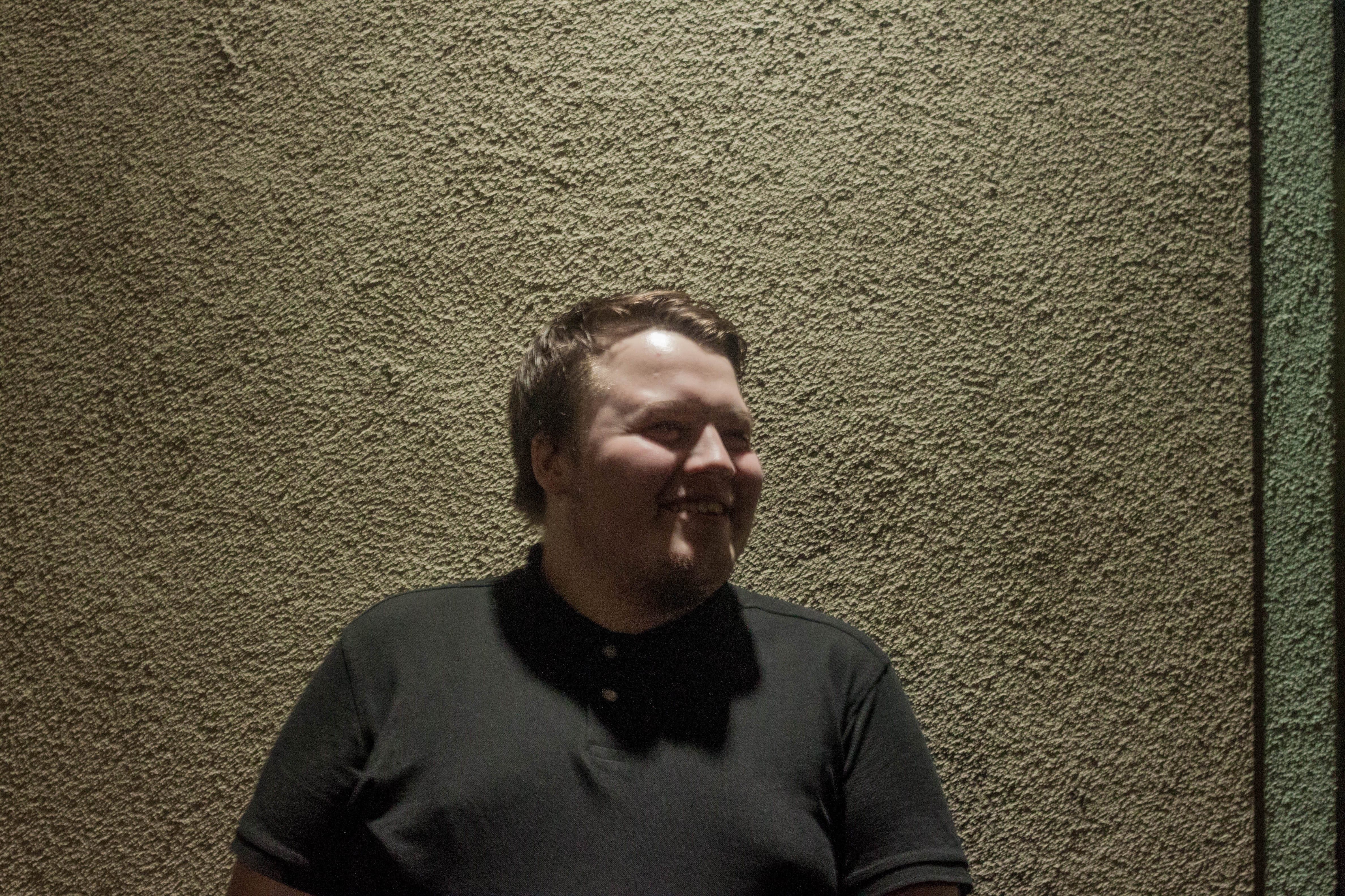
The second image I wanted to obscure the models face, I did this by getting them to look straight ahead getting the light to not hit their face as much. Then in light room I brought the shadows up slightly. The source of light can not be seen in the image but you can see the beam it’s producing against the wall, I feel this gives a spotlight like effect and creates a dark and mysterious atmosphere.
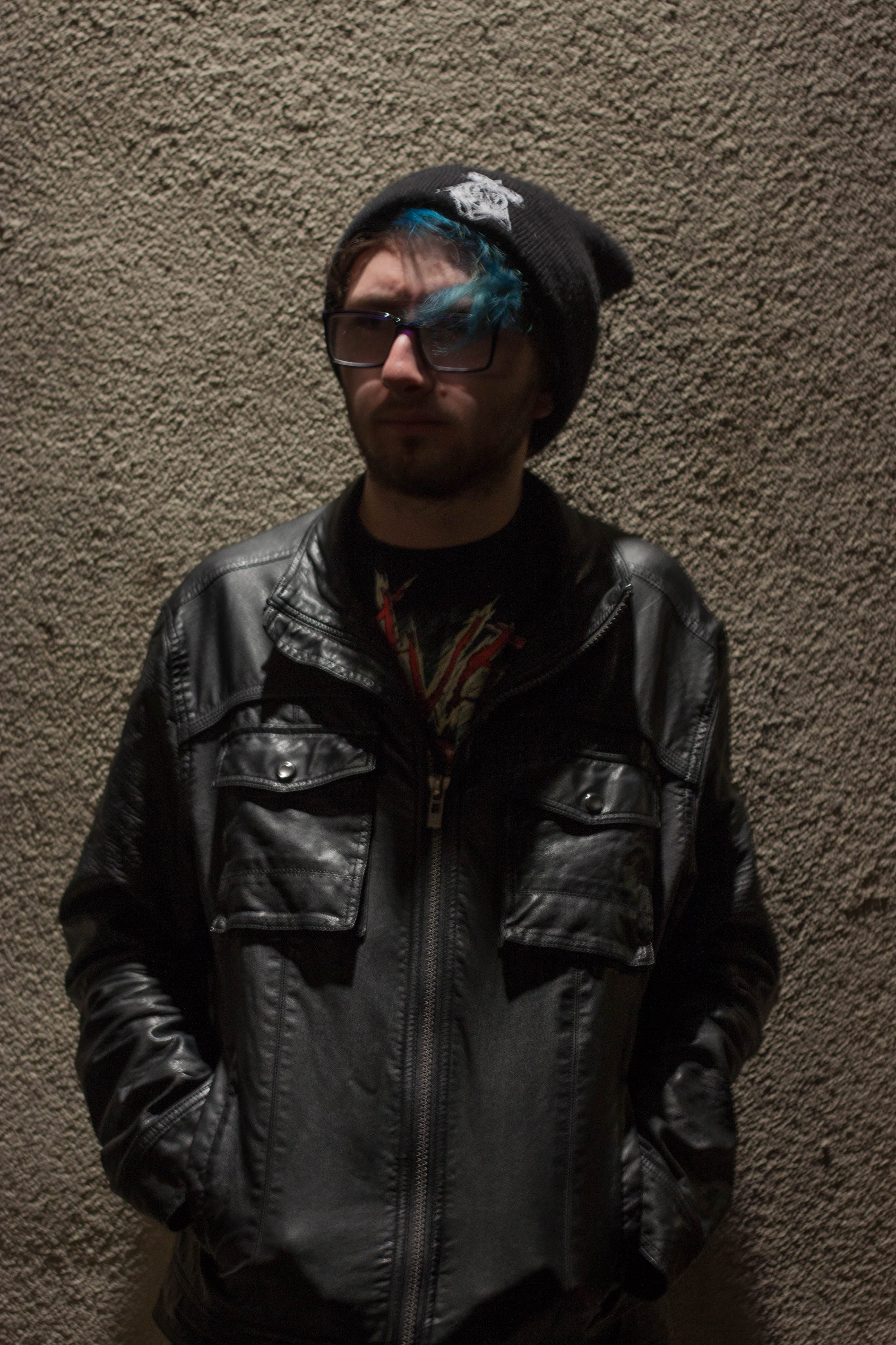
Portrait 3Portrait 4
Portraits 3 and 4 are both very similar in terms of the models pose but between them i changed the distance from the model leaving more of the area around the model. I turned up the clarity of the images to bring out the textures of the wall behind which gives it a nice rough look which matches that of the leather jacket. I made the background lighter to help show the texture of the wall. I managed to keep some shadows on the model while keeping the detail in the image.
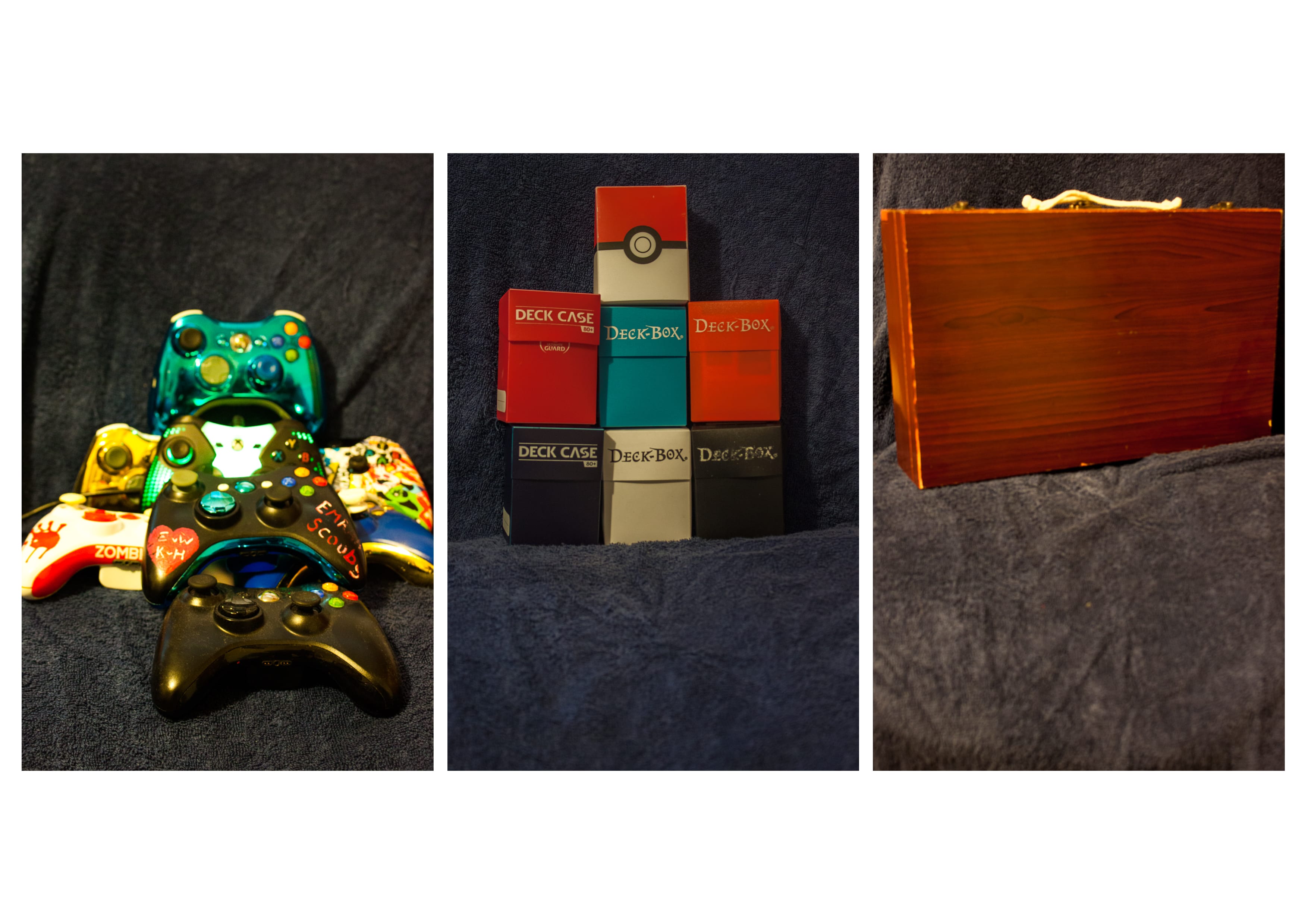
For my triptych i decided to photograph images that represent different hobbies. the first image is made up of various Xbox controllers to represent the hobby of gaming, the multiple controllers have various colours which meant that the image would have a variety in colour which adds alot of variety to the image which could be interpreted as the variety of different games. the second image is a stack of card game deck holders to represent the hobby of trading card games, the different styles of deck box show the variety of card games or the different styles of play there are in card games. The third and final image is that of an art box, it’s shut to represent how art can be anything much like there could be anything in that case if you didn’t know it was all art peripherals, art is also known to be very colourful so not only are the three images linked by the theme of hobbies but also buy how colourful they each are. Also it is to be noted that the second image in the middle has the background brighter, this was purposely done to draw attention to the centre of the image and as a result the whole of the triptych.
Appropriation is taking an already existing piece and then changing it visually so the context and meaning of the piece. In maybe cases this is by photoshopping the piece with additional images or text. In the world of artists Appropriation has caused some commotion we some believing it to be stealing of the original piece. Where others believe that Appropriating it and changing the meaning being the piece means it is something new.
One of my inspirations for my work was Richard Prince or to be more precise the one image that he appropriated of a magazine cover which was of a cowboy riding a horse through a desert landscape. it gave me this idea of messing about with removing text and adding text to different images. Which i used more in my frozen piece of appropriation. Richard Prince has had a lot of controversy in the past with is art work and whether or not it classes and art and also as his, this is due to the whole ideal of appropriation in which it’s an already image that exists being modified to create a new meaning.
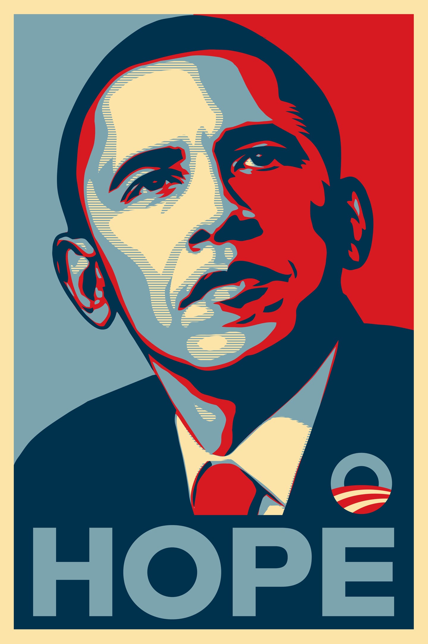
Another inspiration was of Frank Shepard Fairey who created the original “HOPE” image of Barack Obama by editing a picture of Barack Obama to give it a contrast between red and blue, with small yellow and pale blue strips. this makes the image very clear and sharp while the colours makes it stand out. Fairey also came under legal fire for the idea of Appropriation since he used an image of Barack Obama and the original photographer owns the right to the image. Fairey is know for being a street artist you can see that in the use of colours and contrast in the hope image.
A third inspiration was the website adbusters, who take advertising images and appropriate them to have a meaning that normally shows the darker side of a company, such as taking fast food adverts and turning it into a piece based on health and how unhealthy fast food is. This helped inspire my final image not only with the subject of fast food but with the idea of mixing a company logo with another image to create a new meaning.
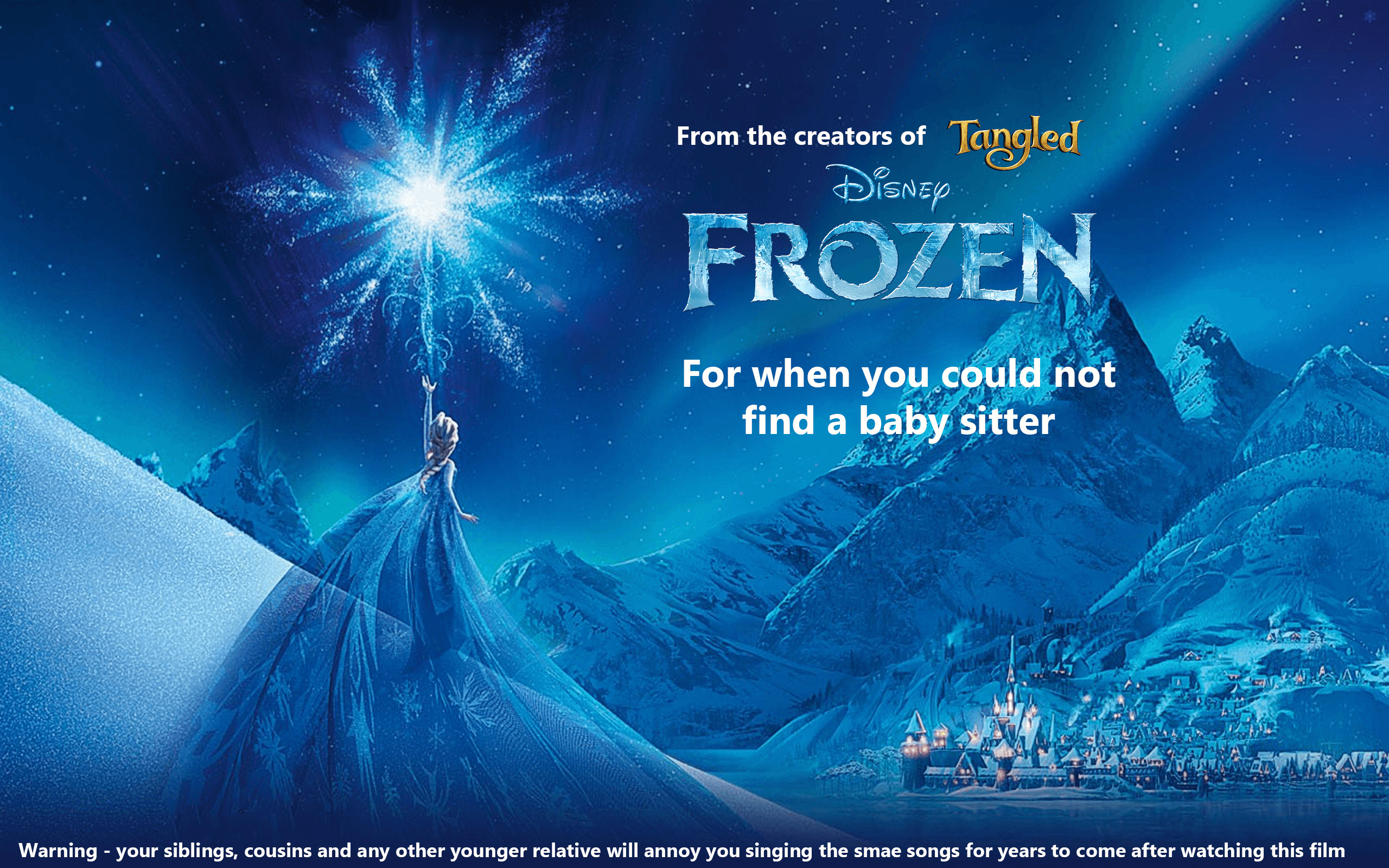
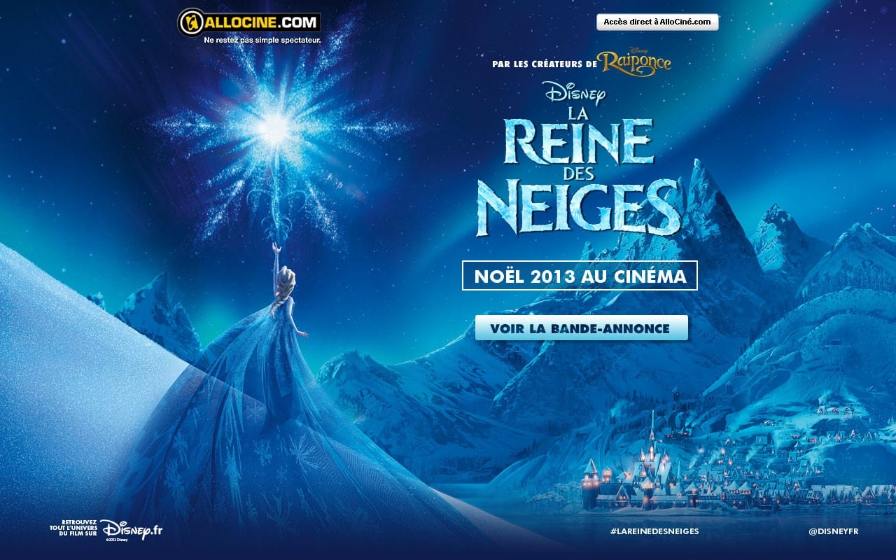
I decided to take one of the posters for Frozen and appropriate it to show an opinion on the film and how it is used as a baby sitting tool but also turns younger children into an annoyance with their renditions of the musical numbers in the film. I decided to go for the French character poster of Elsa due to how more art like the design of the poster is and it left me room to leave text just like the original poster. i also found the logos for Frozen and Tangled to add them to the image since the original had them in French. As you can see below the original poster has alot more logos and writing on. I decided to simplify it to make it more like English/American style posters. I find this also has the effect of showing the art of the poster off more.
Original French version
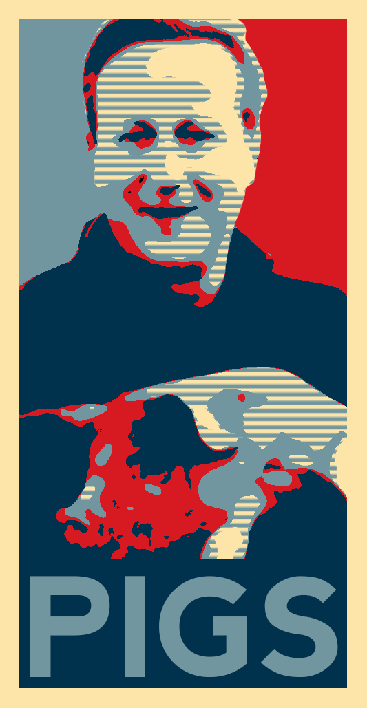
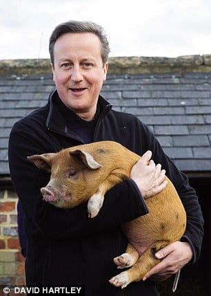
For my second piece I decided to appropriate the recent image of David Cameron holding a pig and then use it to parody the “HOPE” image of Barrack Obama. this involved copying the same image and changing the threshold to various levels then colouring each a separate layer and then add in shapes to the back group of the image then text to the bottom. i wanted to relate the hope the the leader of America bring to his country while the counterpart in the UK is currently a laughing stock due to a news story involving the prime minister and a pig. Below is the original version of the hope image and the original David Cameron image.
The original David Cameron imageThe original “HOPE” image
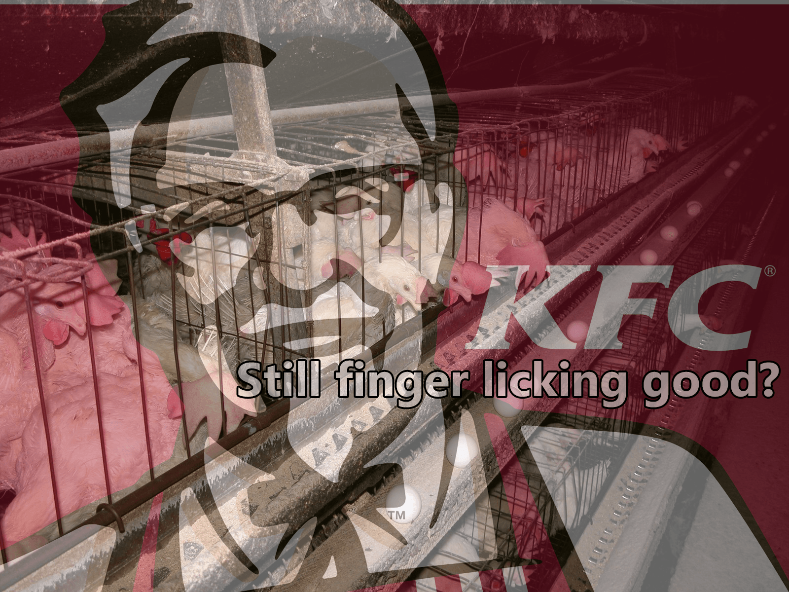
For my third and final image i took the KFC logo and made it slightly transparent over the top of an image of a chicken battery farm. I then added the caption “Still finger licking good?” to counteract and parody the KFC slogan of “finger licking good” as if the image is enlighteing the viewer after seeing where the chickens come from. the image of the logo over the top of the true source of the food is a shock factor to most people to see the living conditions of the animals that we later eat.